 ClothMother_old
You don't feel you could love me, but I feel you could... |
Tuesday, October 19, 2004
Fun with work email [Geek tag] I'm in Japan for the week, presenting the results of a largish scale qualitative study we ran with Japanese physicians about a new product getting ready to launch here. Among the many things we did was to get some interesting rating data about how they view this new product in light of what they already have to use in the treatment category. This in turn tells us where the new drug is likely to "live" when it does launch (assuming nothing hinky happens in the time between now and next year, like people in the clinical trials suddenly growing a third eye or something). One of the things one can do with rating data like these is to create a perceptual map, which is a visual landscape of all the products along related dimensions. Here's an example of a perceptual map, with an explanation of how they work. When you generate one of these puppies, you often have to compress a lot of product variability into two-dimensional space. Sometimes this is an uncomfortable fit, and some subtle relationships aren't accurately represented in the X-Y plane, because you have to imagine the products living in 3 or more dimensions relative to each other. (So, two points may look far apart on your map, but if you rotated it so that you were looking at it in profile, you see that they're actually very close in 3D space, but that relationship is obscured because of the perspective you took). That's the art to the science: generating a sensible picture without blowing the audience's mind. (This is way too much backstory and now it's not going to be nearly as funny as I thought it was, but what the hell I'm forging ahead.) We generated a ton of these (by different specialties, by location of the interviews) and they all looked pretty much the same. Use the Winkipedia example as ours. 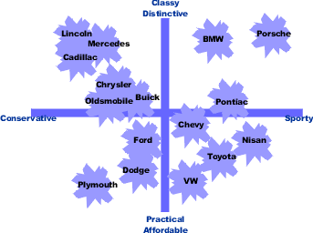 I had a question for one of my quant gurus about how to account for the fact that if you look at the raw rating numbers, Dodge and BWM were a lot closer on the "Sporty" variable than the map showed them to be. I had the vague notion that it had to do with dimensionality in the map and the fact that mapping takes other variables into account than just a statistical comparison between two. So the raw numbers aren't as revealing as the map (less complete). But I wrote a very urgent jet-lagged email for confirmation, just to guard against the challenging question that leaves me looking like this guy:  Here is the reply to my email request: -----Original Message-----To which I almost immediately replied: K:[/geek] Okay, way too much setup, not enough payoff. Just a way to showcase my being clever in a serious work environment (isn't that why we're here?) but it gets a B- for execution cause you waited so long... |